GRAPHIC DESIGN
CORPORATE BRANDING
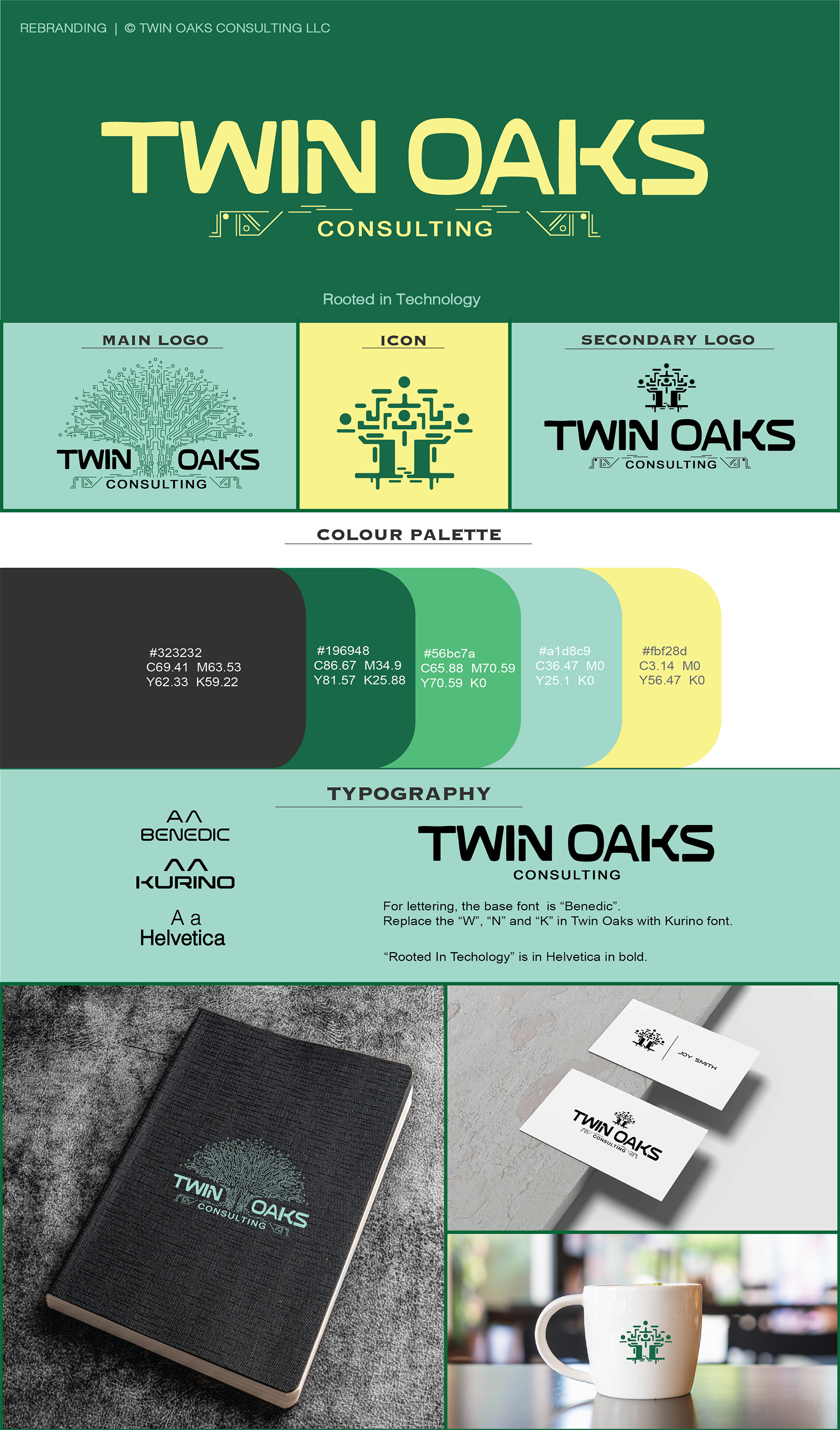
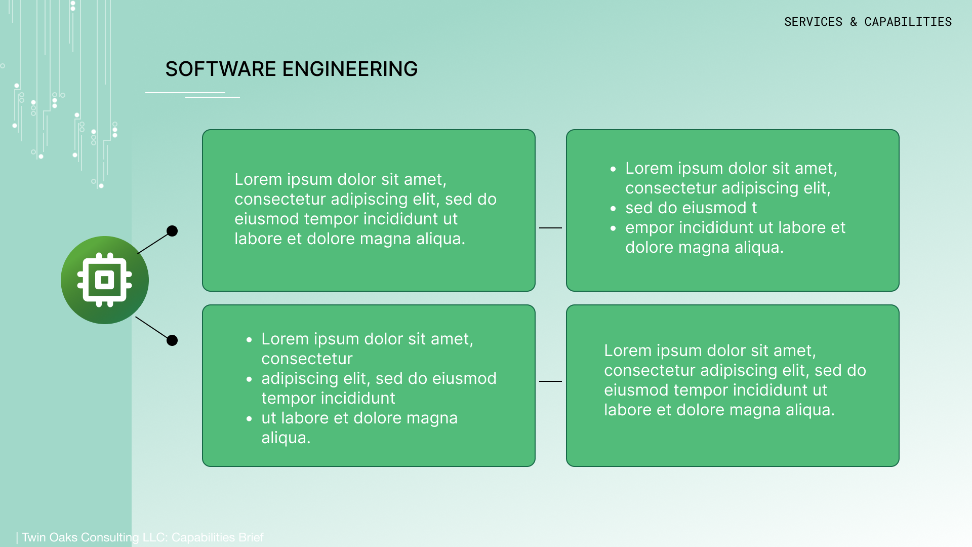
Spearheaded a complete rebrand for Twin Oaks Consulting LLC, a government subcontracting company based in IT. Worked closely with managers and the ownership group to build up an elaborate design system and brand identity. Created a digital asset Library including: Logos, Icons, Document and Presentation Templates, Flyer Templates, Mock-ups, and Brand Identity Sheets.
Problem: The company felt out of date, so they aimed to modernize assets and website to keep up with competition and attract new hires. The original branding felt more like a landscape company than a tech company. The company wanted to keep the green.
Solution: I developed a visual language that centered around circuit boards that built up or surrounded the typography and the overall logo images and icons.
Software use: Procreate (sketching), Photoshop (Logo creation), Adobe Illustrator (Logo creation, Formatting, Compositing, Template creation), PP, and Figma (Presentation Components and creation)

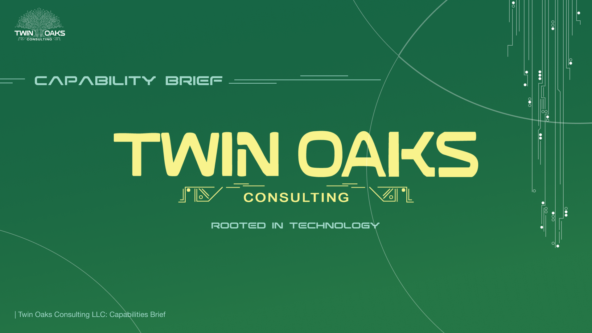

NEW
OLD
MARKETING DESIGN
Company Event Invitations centered around a crab feast and a boat.
Software use: Procreate (Illustration), Photoshop (Formatting), and Adobe Illustrator (Type)


COVER DESIGN
PROJECT | 1
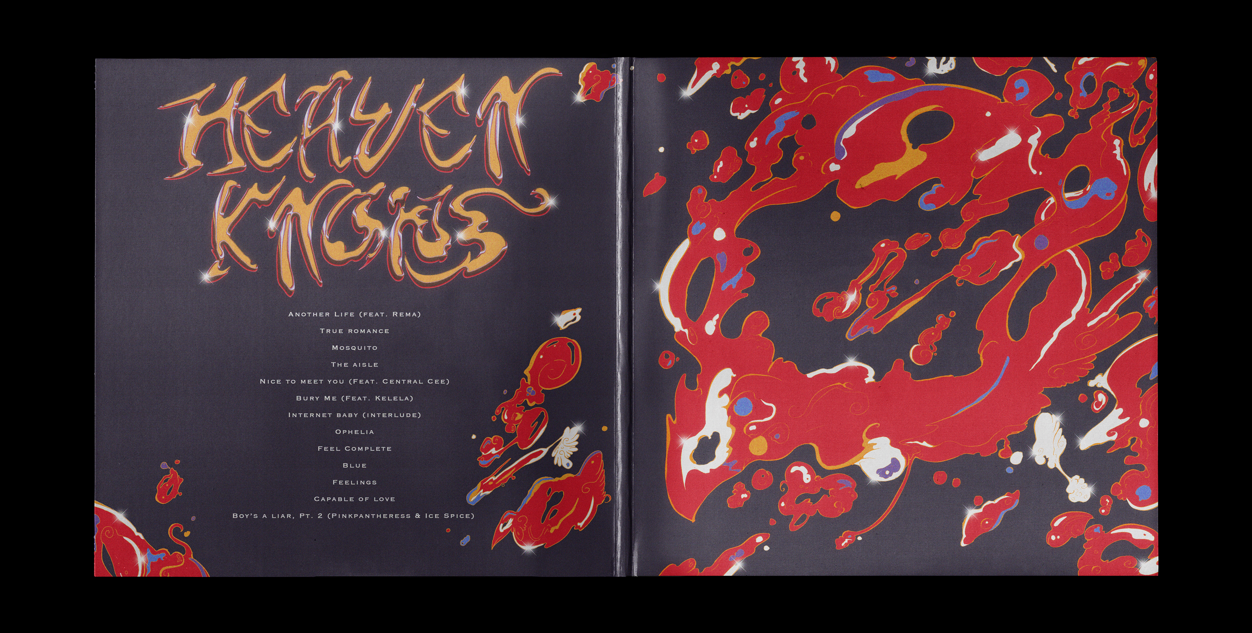
Album Cover Redesign (PinkPantheress, Heaven Knows)
Software use: Procreate (Illustration), Photoshop (Effects and Formatting), and Adobe Illustrator (Typography)
Personal Project


Project | 2
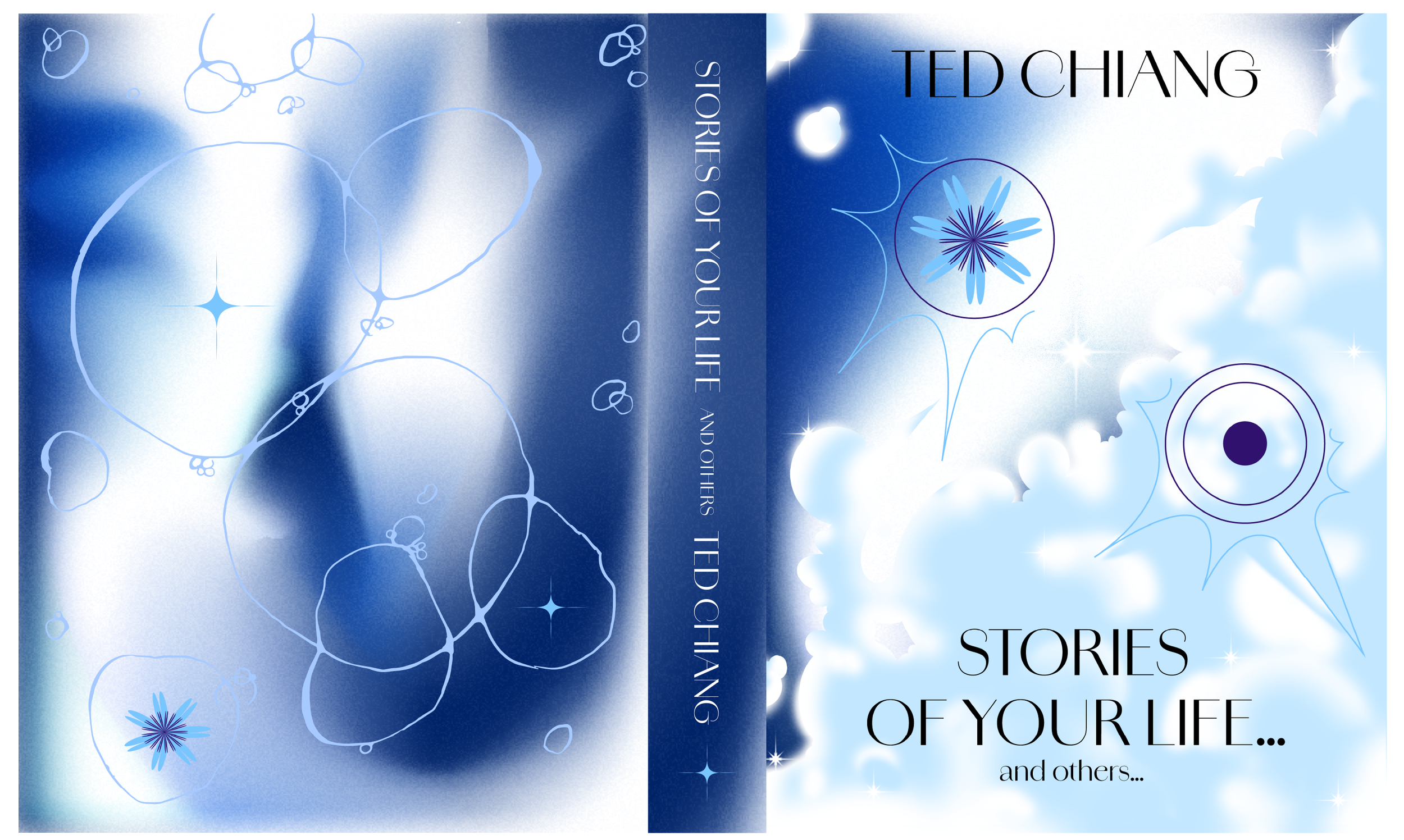
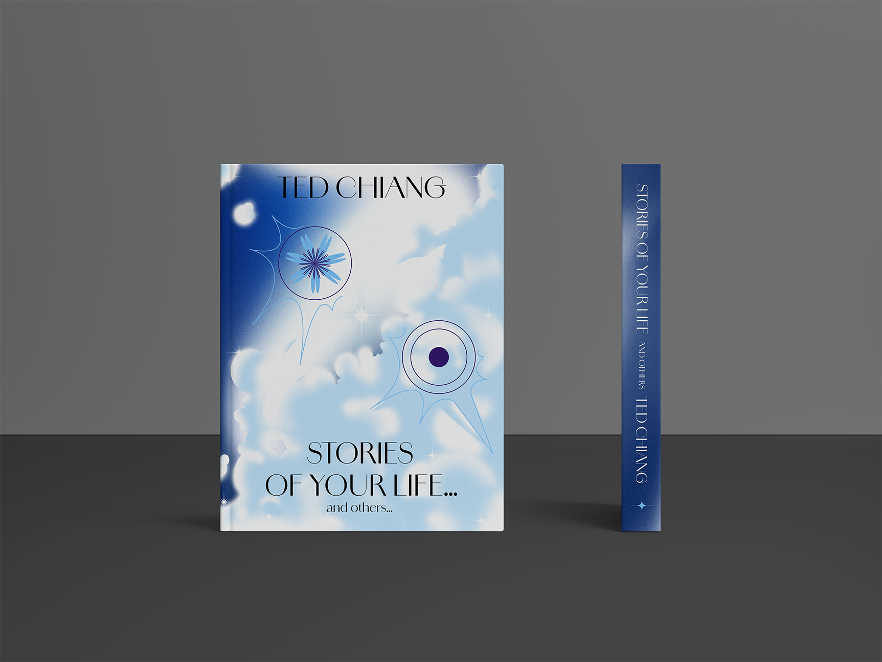
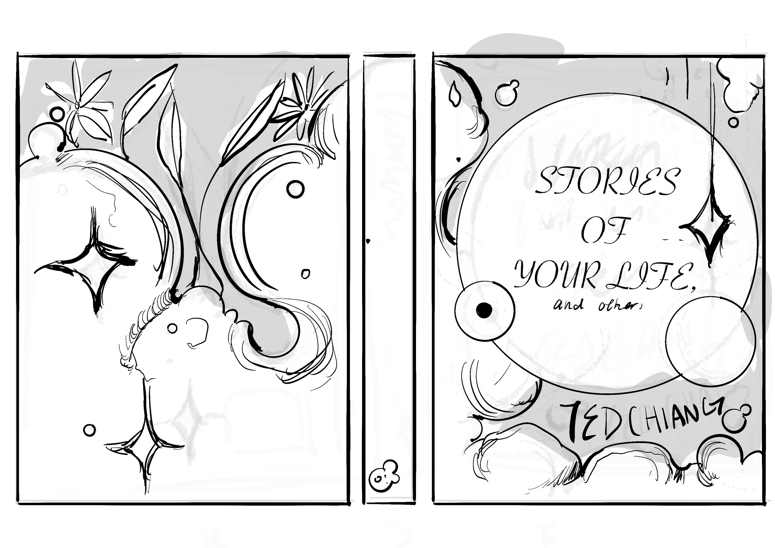
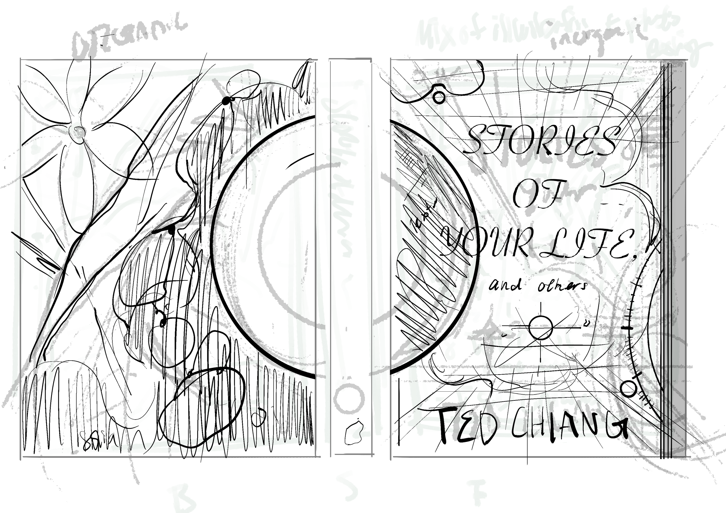
Book Cover Design: Stories of Your Life and Others by Ted Chiang
Software use: Photoshop, Procreate, and Illustrator (Editing, Type, Effects, Formatting, and Mock-Ups)
Personal Project
Project | 3
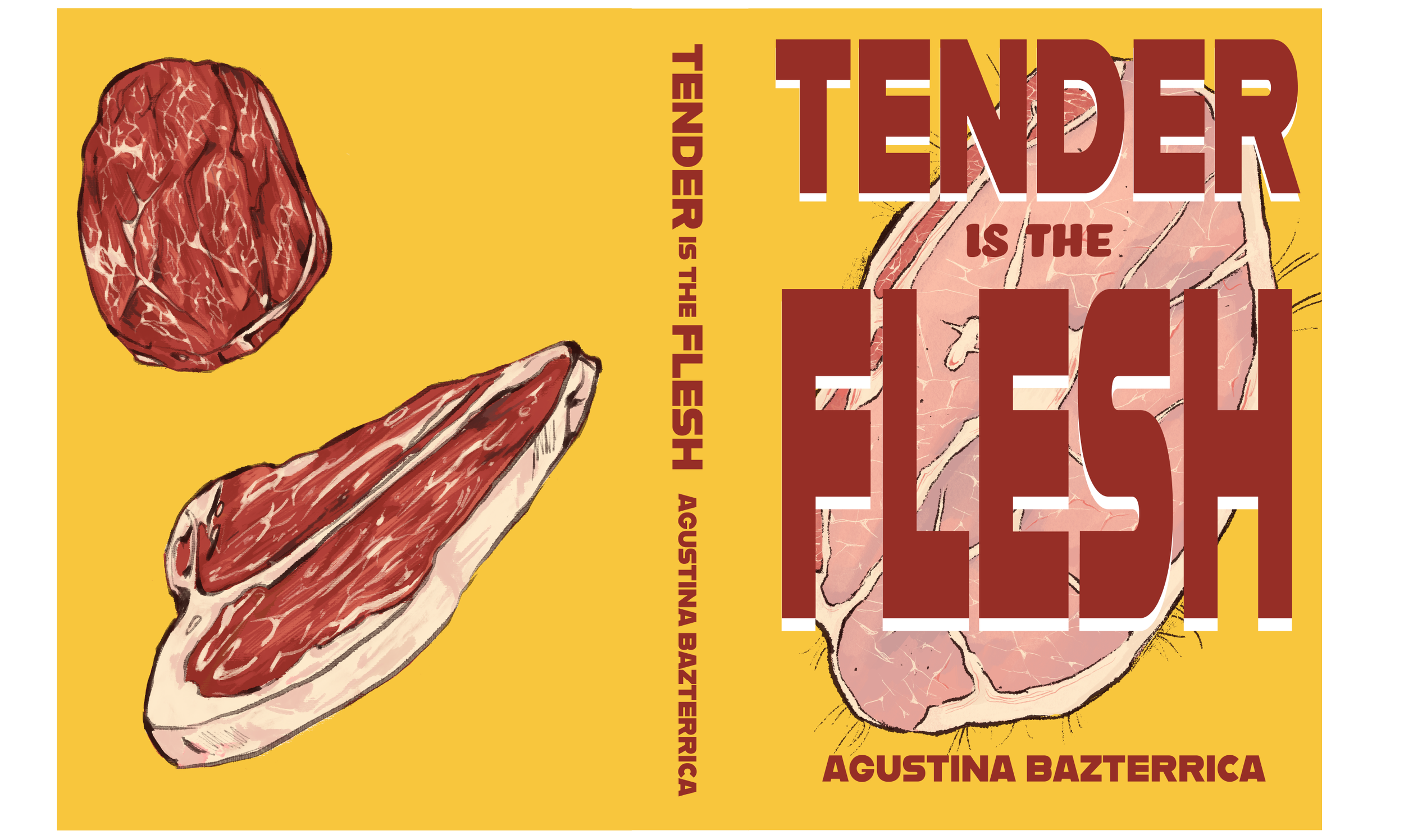
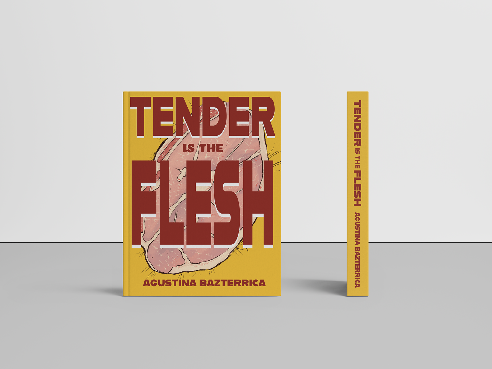
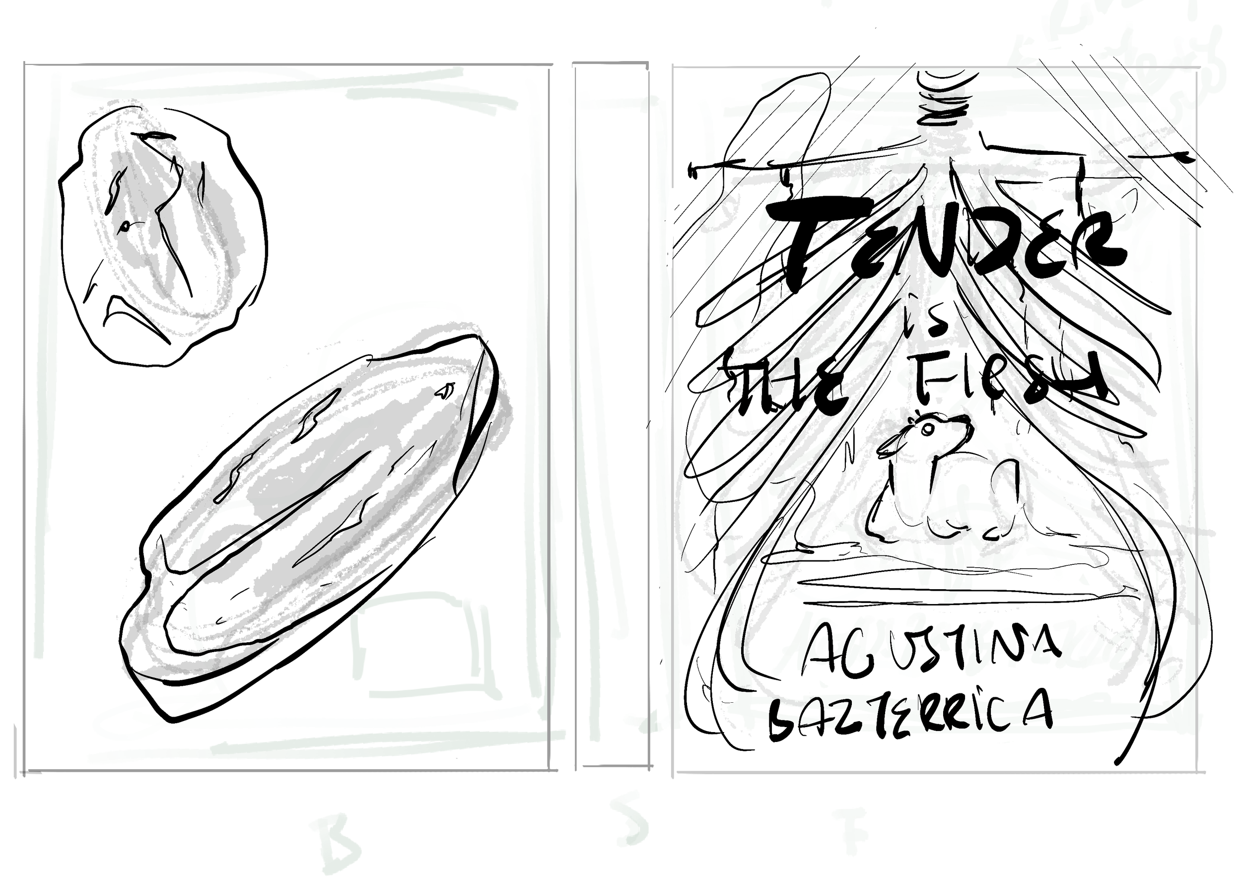
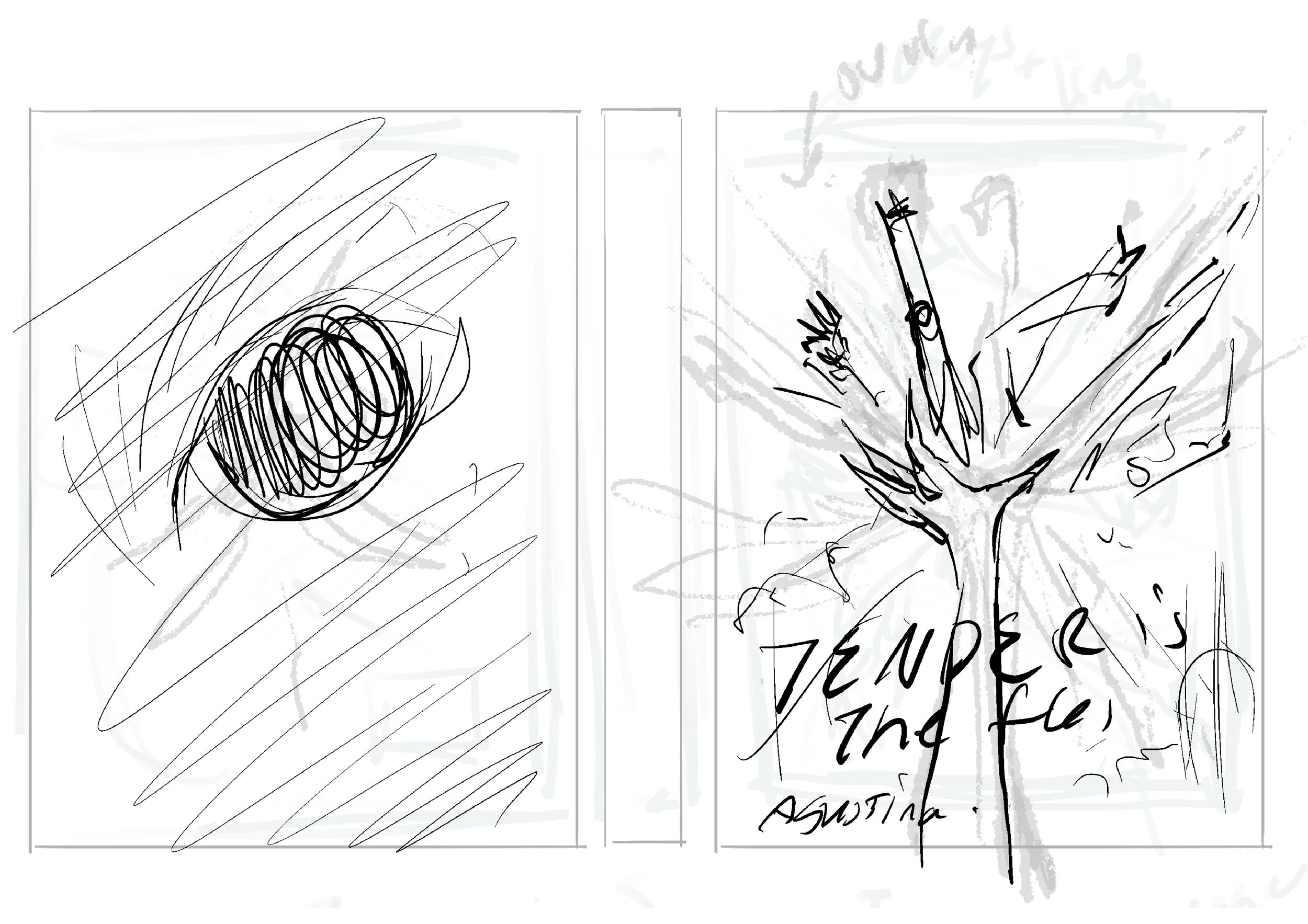
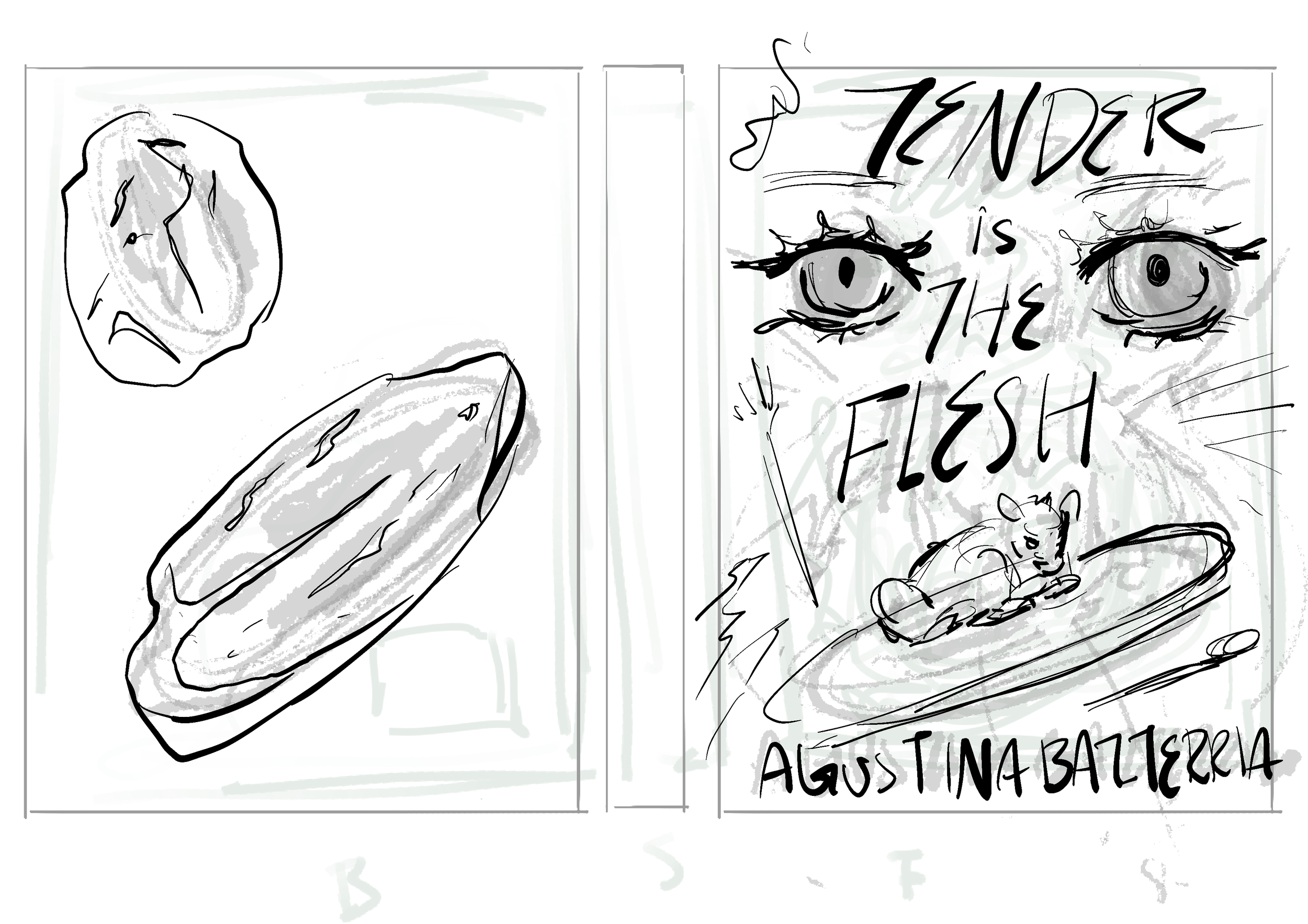
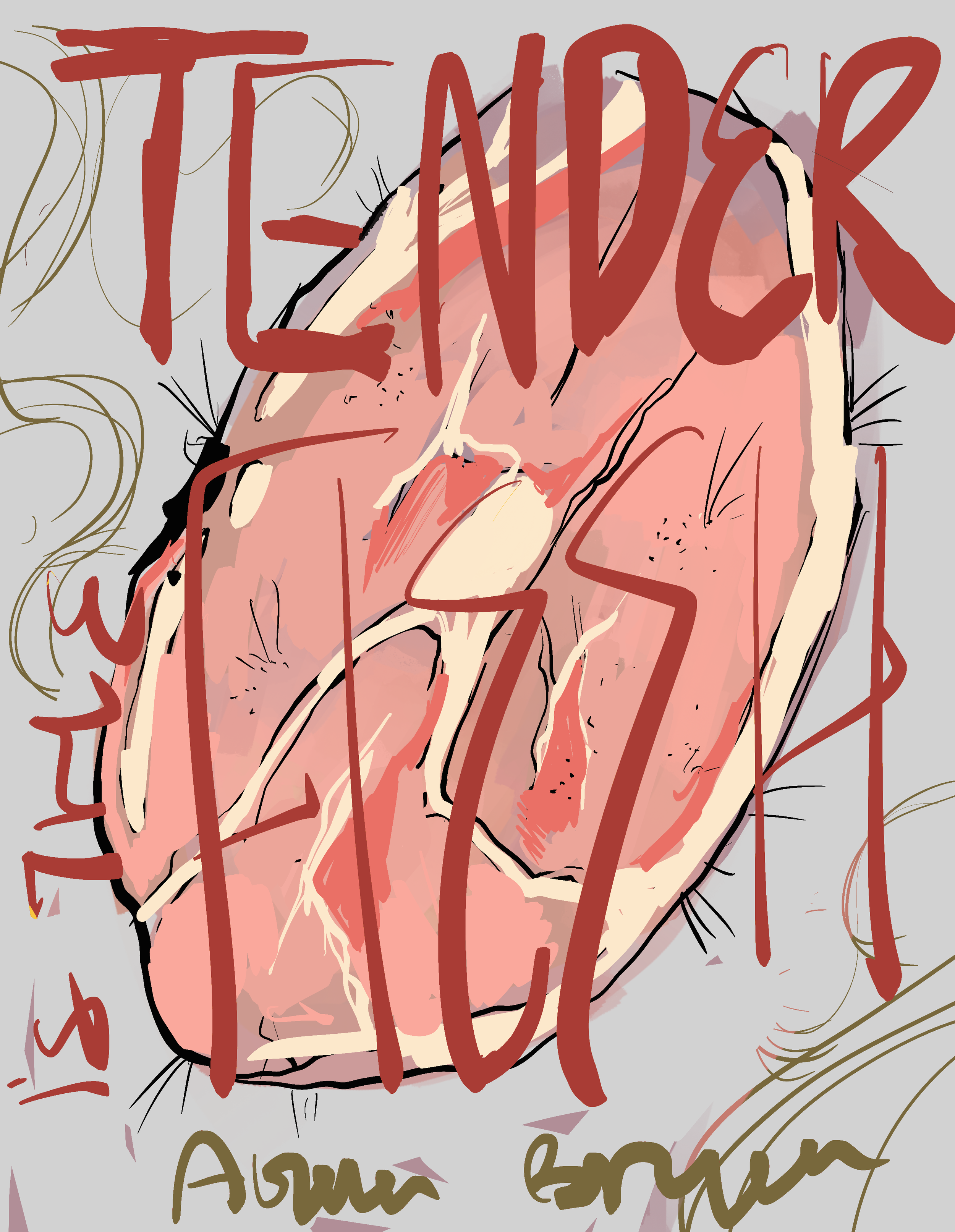
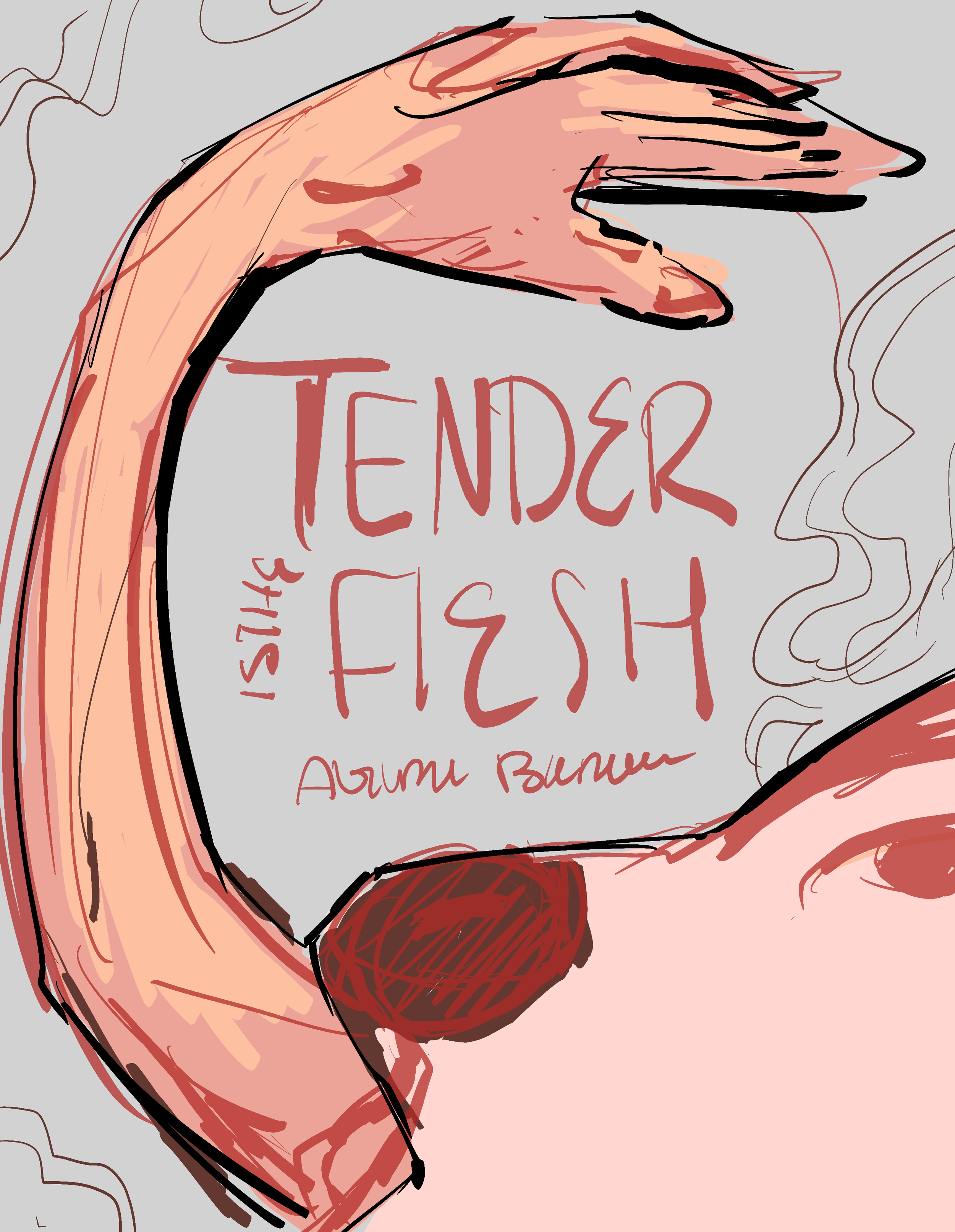
Book Cover Design: Tender is the Flesh by Agustina Bazterrica
Software use: Photoshop, Procreate, and Illustrator (Editing, Type, Effects, Formatting, and Mock-Ups)
Personal Project
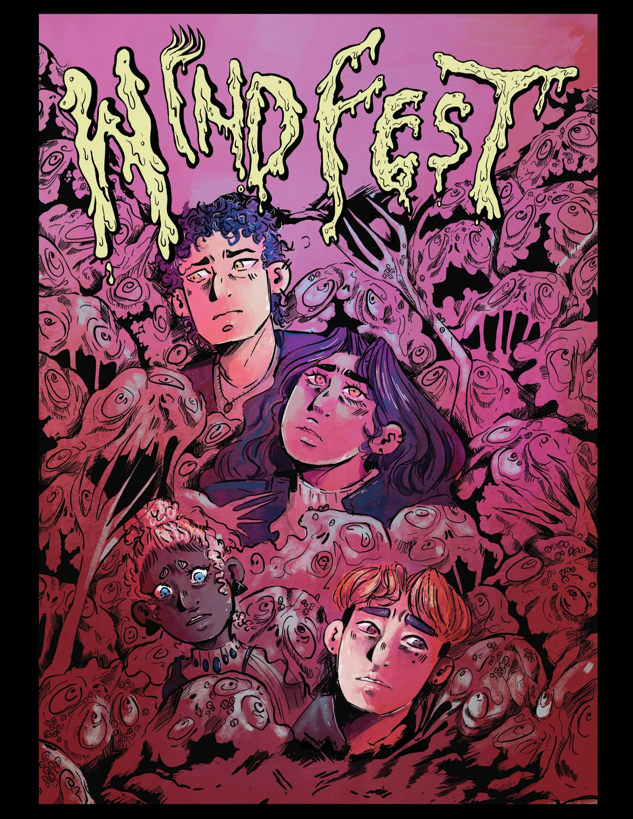
PROJECT | 4
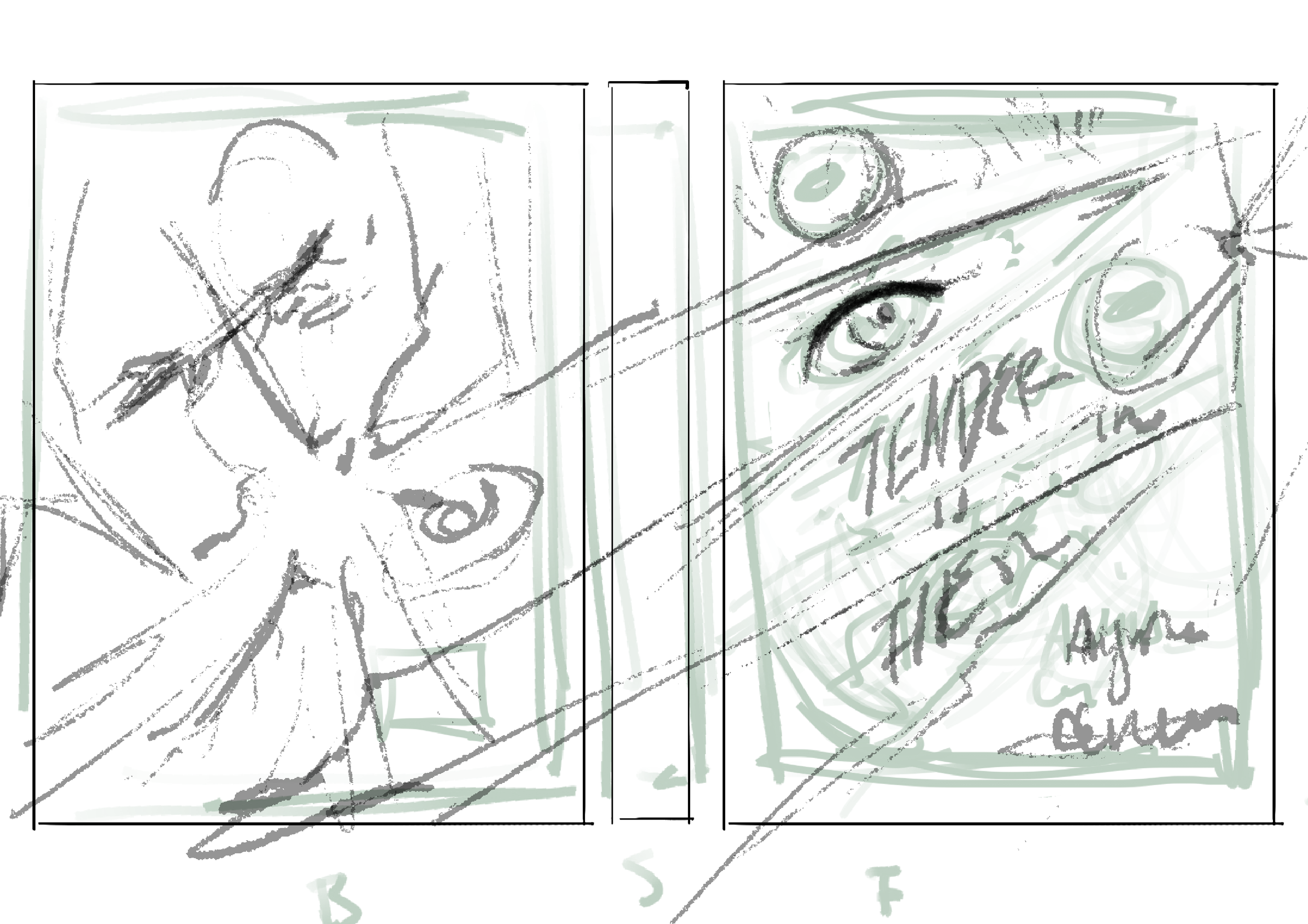
Graphic Novel Cover:
For the Windfest graphic novel, I had to create a book cover. Using Procreate and Adobe Photoshop, I drew unique, hand-drawn typography that draws the viewer’s eye, contrasts with the cover illustration, and hints at the book's plot. The goopy shape language plays with letter thickness and mimics the characters.